Atlantis
- Atlantis Introduction
- Workflow
- React Code Style and Architecture
- Future Articles
- Official React Documentation
- File and Folder Structure
- Code Ordering Style
- Custom Hooks Style Guide
- Conditional Rendering
- App Wide State
- Events and Listeners
- Loading Inidicator
- Localization
- Routing
- Permission and Feature Validation
- Virtualization and Infinite Scrolling
- Modals
- Component Library
- Cert Refresh for Local Atlantis Projects
- Running Atlantis Front End in Visual Studio Code (VS Code)
- POC: UserStorage
Atlantis Introduction
Intent
The Atlantis project encapsulates the next-gen architecture and UI/UX redesign for the Rubex application. The goal of this project is to improve the user experience, feature adoption, performance, maintainability, scalability, and extensibility of the Rubex application/platform.
The changes we will be making include:
- Moving from a monolithic web application to a separated front-end/back-end API-driven architecture using microservices, which will drive enhanced scalability, maintainability and performance
- Moving from an Infrastructure as a Service (IaaS) cloud model to a Platform as a Service (PaaS) model, which will drive enhanced scalability and extensibility
- Moving to a more modern front-end development language/platform (React) with a new comprehensive UI/UX redesign, which will drive a better user experience and increased feature adoption across the application
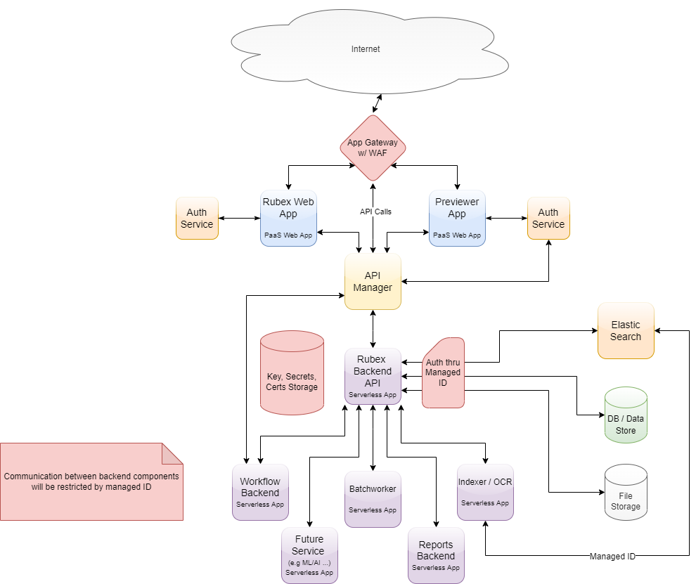
Cloud Model
To begin the discussion of our cloud strategy, we wanted to come together and agree on some basic principles we could use as a foundation. We discussed the differences between an Infrastructure as a Service model and a Platform as a Service model.
The slides we put together for the discussion can be found here: Next-Gen Architecture
We aligned on our path forward of moving to a PaaS cloud model. A high-level diagram of the next-gen architecture with data flow is below:
Workflow
Architectural Design
Introduction
Workflow is and must be dynamic. It is also an ongoing process that accumulates data as it goes, using that data to inform and influence future operations. To that end, the technical architecture of Workflow will be made up of Tasks and Task Groups.

Tasks
Tasks are intended to be a single activity. (i.e., Move a document, Approval, etc.) Every Task
React Code Style and Architecture
Future Articles
The following are items that we would like to have documented in the future. Most have not been documented because they are awaiting design.
-
ADA Compliance
-
Uniform Exception Handling
-
Infinite Scrolling
-
Standardized Loading Indicator / State
-
Localization
-
UseForm
Official React Documentation
- https://beta.reactjs.org/learn
- beta.reactjs.org has much more modern docs. Most all of the examples on reactjs.org use class components rather than function components.
It is recommended to read most of articles in the Learn section of https://beta.reactjs.org
File and Folder Structure
File and Folder Structure should match the UI as closely as possible.
There are cases where hooks, interfaces, enums, or components need to shared in multiple places and they should be placed in the following folders.
-
api
- hooks to send requests to the backend
- hooks
- other custom hooks (like useForm)
- types
- files for interfaces and enums
Code Ordering Style
Import Ordering:
- React
- Packages
- EFC packages
- Internal references
- CSS
-
Expanding of Props
-
const {recentNodes, maxRowsToDisplay } = props;
-
- React Hooks (except useEffect)
- useState, useContext, etc
- Custom Hooks
- useSomeApi, useForm, etc
- Other Variables and Methods
- can be intermixed
- Effects (useEffect)
- return statement
The following is an example of how properties are ordered in a component function
export const RecycleBin = (props: RecycleBinProps) => {
const { active } = props;
const [showConfirmation, setShowConfirmation] = useState(false); const [recycleBinItems, setRecycleBinItems] = useState<RecycleBinItem[]>([]); const [selectedItems, setSelectedItems] = useState<RecycleBinItem[]>([]);
const { getItemIcon, restoreRecycleBinIcon, recycleBinIcon } = useIcons(); const { getRecycleBinFiltered, purgeFromRecycleBin, restoreFromRecycleBin } = useRecycleBinApi();
const { t } = useTranslation('RecycleBin');
const openPurgeConfirmation = () => setShowConfirmation(true); const closePurgeConfirmation = () => setShowConfirmation(false);
const getRecycleBinItems = () => { getRecycleBinFiltered(initFilterProps).then((items: RecycleBinItem[]) => { setRecycleBinItems(items); }); };
const onSelectItems = (items: RecycleBinItem[]) => { setSelectedItems(items); };
const getIcon = (item: RecycleBinItem): EfcIconProps => { const fileExt = item.node.name.slice(item.node.name.lastIndexOf('.')); return getItemIcon(item.node.systemType, fileExt); }; const purgeSelectedItems = () => { openPurgeConfirmation(); };
const purgeItem = (item: RecycleBinItem) => { if (!!item) { setSelectedItems([item]); openPurgeConfirmation(); } };
const confirmPurge = (confirmed: boolean) => { closePurgeConfirmation();
if (!!confirmed) { purgeFromRecycleBin(selectedItems.map((item) => item.node)).then(refreshList); } };
const restoreSelectedItems = () => { restoreFromRecycleBin(selectedItems.map((item) => item.node)).then(refreshList); };
const restoreItem = (item: RecycleBinItem) => { restoreFromRecycleBin([item.node]).then(refreshList); };
const refreshList = () => { getRecycleBinItems(); setSelectedItems([]); }; const columns: (string | EfcTableColumnInfo)[] = [ { name: 'node.name', searchBy: true, displayName: t(RecycleBinKeys.Name), useIcon: getIcon }, { name: 'dateDeleted', searchBy: true, displayName: t(RecycleBinKeys.DateDeleted), isDate:true }, { name: 'path', searchBy: true, displayName: t(RecycleBinKeys.Path) }, ];
const bulkActions: EfcCallToActionInfo[] = [ { text: t(RecycleBinKeys.Purge), icon: recycleBinIcon, onClick: purgeSelectedItems }, { text: t(RecycleBinKeys.Restore), color: 'primary', icon: restoreRecycleBinIcon, onClick: restoreSelectedItems }, ];
const contextActions: EfcCallToActionInfo[] = [ { text: t(RecycleBinKeys.Restore), icon: restoreRecycleBinIcon, onClick: restoreItem }, { text: t(RecycleBinKeys.PurgeForever, 'Purge Forever'), icon: recycleBinIcon, onClick: purgeItem }, ];
const confirmationCTAs: EfcCallToActionInfo[] = [ { text: t(RecycleBinKeys.Cancel), color: 'primary', emphasis: 'med', onClick: () => confirmPurge(false) }, { text: t(RecycleBinKeys.Purge), color: 'primary', emphasis: 'high', onClick: () => confirmPurge(true) }, ];
useEffect(() => { if (!!active) { getRecycleBinItems(); } }, [active]); return ( <div className='my-2'> <Suspense> <FullTable data={recycleBinItems} columns={columns} bulkActions={bulkActions} contextActions={contextActions} onSelect={onSelectItems} /> {recycleBinItems.length == 0 && <Text> {t(RecycleBinKeys.EmptyMsg)} </Text> }
<Modal toggle={closePurgeConfirmation} title={t(RecycleBinKeys.AreYouSure)} isOpen={showConfirmation} ctas={confirmationCTAs}> <Modal.Body> <Trans t={t} count={selectedItems.length} i18nKey={RecycleBinKeys.PurgeConfirmMsg}> {{ count: selectedItems.length }} files will be permanently removed from your account and will not be able to be recovered. </Trans> </Modal.Body> </Modal> </Suspense> </div> );};
Custom Hooks Style Guide
When writing custom hooks follow guidelines as described in Code Ordering Style.
On top of code ordering, the following guildlines should also be followed
- return object should not have any inline functions. Functions on the return object should be declared above the return statement like in the following example.
-
export const useFileUploadApi = () => {const deleteAllFailedFileUploadsAsync = async () => {const resp: AxiosResponse = await Api.delete('api/FileUpload/Failed/All');return resp.data as UtopiaUploadFileResponse[];};const deleteFailedFileUploadAsync = async (nodeId: string, uploadIdentifier: string) => {const resp: AxiosResponse = await Api.delete(`api/FileUpload/Failed?nodeId=${nodeId}&uploadIdentifier=${uploadIdentifier}`);return resp.data as UtopiaUploadFileResponse[];};const queryFailedFileUploadsAsync = async (start: number, count: number) => {const resp: AxiosResponse = await Api.get(`api/FileUpload/Failed?start=${start}&count=${count}`);return resp.data as UtopiaUploadFileResponse[];};return {deleteAllFailedFileUploadsAsync,deleteFailedFileUploadAsync,queryFailedFileUploadsAsync};};
-
Conditional Rendering
React has a tutorial on different ways to conditionally render JSX and can be found here.
Conditionally Including JSX

Doing it this way is discouraged
Conditional (ternary) operator (? :)

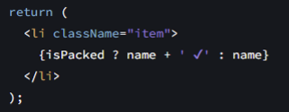
This is how you do 'if else' statements
Avoid having nested ternary operators
Nested ternary operators may indicate you need create more components
It is okay to have multiple components to the same file (so don't hesitate to add more if improves maintanibility)
Logical AND operator (&&)
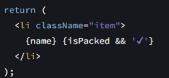
Equivalent to ngIf in angularjs
Style
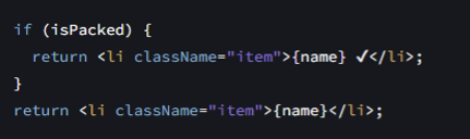
Ternary Operators can get makes things look messy quick, so it's important to style it appropriately.
The following is example of how one might use a ternary on two larger pieces of JSX.
Notice how the ':' is the only thing on the line to really help differentiate what is the if block and what is in the else block.
Notice also the use the && operator throughout the JSX.
return (
<>
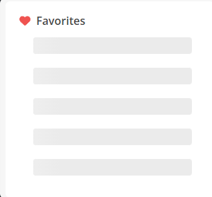
<Card.Title tag={Link} to={RoutePath.Portfolios} className='no-decoration' size='lg' bold icon={{ ...icons.favoritesIcon, pull: 'left', color: colors.utopiaHeart, size: 'md' }}>
{ !!favoritesPortfolio ? favoritesPortfolio.name : 'Favorites' }
</Card.Title>
{((!!isLoading || !!errorLoading || !user)) ?
<>
{(!!isLoading || !user) &&
<SkeletonTheme enableAnimation height='24px' width='85%'>
<Skeleton count={NUM_NODES/2} className='mb-3 ms-4 me-4'/>
</SkeletonTheme>
}
{!!errorLoading &&
<Card.Text>There was an issue when loading your favorite nodes.</Card.Text>
}
</>
:
<>
{(!favoritesPortfolio) &&
<Card.Text>No portfolio has been set as the Favorites portfolio. Right-click a portfolio in the My Portfolios page to set a Favorites portfolio.</Card.Text>
}
{(favoritesPortfolio?.nodes.length == 0) &&
<Card.Text>No favorites selected yet. Right-click files or folders and choose “Add To Portfolio” to add to Favorites.</Card.Text>
}
{favoritesPortfolio?.nodes.slice(0, NUM_NODES).map((node) => (
<Card.Link key={node.id} tag={Link} to={`${RoutePath.GoToNode}/${node.id}`} className='ms-4 my-3' icon={{ ...icons.getItemIcon(node.systemType, node.fileInfo?.fileExtension), size: 'md' }}>
<TooltipItem innerClassName='truncated-text' id={node.id} message={node.name}>
{node.name}
</TooltipItem>
</Card.Link>
))}
{(!!favoritesPortfolio && favoritesPortfolio.nodes.length >= NUM_NODES) &&
<div className='d-flex justify-content-center'>
<Button color='primary' emphasis='low' onClick={() => navigate(RoutePath.Portfolios)}>See all</Button>
</div>
}
</>
}
</>
);App Wide State
We implement app wide state by using Context.
Context
reactjs.org has a tutorial for Context and the official documentation can be found here.
In Atlantis
We currently use Context in Atlantis. One example of this is AuthContext. It currently stores user info that can be used across the app.
Events and Listeners
Events are typically handled using React's useEffect hook.
useEffect
React has a tutorial as well as documentation that can be found here.
Use effect allows you to run a function every time a state or context property changes.
The following example will run a function every time the user object is updated,
useEffect(() => {
     if (!!user) {
          // do something here
     }
}, [user]);
Lifting Up State
In some cases, you may not even need to use useEffect.
You can lift up state as described in this article.
When a parent component is controlling state, and passing in handler functions as props to children components, may eliminate the need for an event altogether.
Window Event Listeners
We use window.addEventListener is several places. For example, listening for posted messages from the Utopia iframe or listening for resize events to know when we the screen size has reached a new bootstrap breakpoint. Functions that run as callbacks for these event listeners cache state variables, so you can do a couple things to account for this.
- Re-setup the event listener every time a state variable changes
useEffect(() => { window.addEventListener('resize', onScreenResized); return () => { return window.removeEventListener('resize', onScreenResized); }; }, [screenSize]); - Use the functional version of the setter to get the current value of the state variable
setScreenSize(currentScreenSize => {
  if (currentScreenSize != newScreenSize) {
    return newScreenSize;
  }
  else {
    return currentScreenSize;
  }
});
The top answer to this stack overflow question describes some the different ways you can account for this.
Loading Inidicator
We found a cool react component from react-loading-skeleton called Skeleton.
In its props, it lets you tell it how many blurry placeholder items you want it to display.
We use it when waiting for items in a list to load from the back end.
<SkeletonTheme enableAnimation height='24px' width='85%'> <Skeleton count={someConfigurableNumber} className='mb-3 ms-4 me-4'/></SkeletonTheme>
Localization
-
useSafeTranslation hook
-
Define string lookup keys as enums
-
export enum RecycleBinTKeys {
    Name = 'name',
    DateDeleted = 'dateDeleted',
    Path = 'path',
    Purge = 'purge',
    PurgeForever = 'purgeForever',
    Restore = 'restore',
    Cancel = 'cancel',
    ForceCheckIn = 'forceCheckIn',
    PurgeConfirmMsg = 'purgeConfirmMsg',
    AreYouSure = 'areYouSure',
    EmptyMsg = 'emptyMsg',
    PageTitle = 'pageTitle',
} -
Need to be single strings with no spaces.
- enum name should be match the name of the namespace it will be used for, and have TKeys appended to the end.
- All TKey enums are in currently in the same file as the useSafeTranslation hook.
-
-
Use the "t" method
-
t(RecycleBinTKeys.Name) -
If the key doesn't exist it will be added
-
Must run the code and navigate to location
-
-
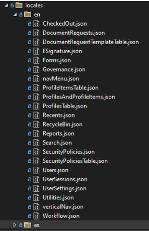
locales folder contains all the string translations
-
Namespace matches the name of the json file
-
If rendering of page needs to wait for the json file to be loaded in use the ready value from useSafeTranslation, around the return value. (May need if page doesn't load and you get white screen)const {t, ready } = useSafeTranslation(TranslationFiles.RecycleBin);return !ready ? null : ( /* all your jsx here */)- This is striked out becuase we have not needed to do this. We're not sure what fixed the original issue but it's not needed anymore, but I've left this here just in case we run into it again in the future.
Plurals
see i18n documentation here. Plurals are useful when the copy needs to change slightly when you have multiple items, for example, when you are deleting 2 items instead of one, you want to add an 's' to the end of a word to make it plural.
- recycle bin area has a purge modal that does this.
Nesting
see i18n documentation here. Nesting is useful when you need pass multiple values into the copy, for example, when you the copy indicates how many file uploads and form fills are in a document request that is assigned to you.
Routing
There is a specific url route for every page and tab within a page in Atlantis. Each has a specific url route. When needed, we also have routes for specifc states of a view or tab.
For example, when viewing a document request you are taken to the document request page, with the Inbox tab selected, but the content that is shown is not the inbox but instead, the document request to be completed. There is also a third state of the inbox tab creating a new document request.
The url routes for each of these states in this example are as follows:
- /docrequests
- /docrequests/inbox
- /docrequests/new
- /docrequests/inbox/:id
Where is routing setup?
In the app.tsx file there is a LayoutRoutes function component. In it, all the different routes in the app are defined.
You will notice that we verify the logged in user has permission to go to the route before we actually add it. This ensures that they will be taken to a not found page in the case they are accidentally routed somewhere they shouldn't have permission to.
In the LayoutRoutes component routes have been grouped by the page they are on.
In the app component (also in app.tsx) you will also notice that we do not render the layout route components until the logged in users account settings and system permissions have been loaded to ensure routes are not rendered until we can validate if they have permission to navigate to a specific route.
RoutePaths.ts
In the RoutePaths.ts file there are many enums (and types) related to routing.
RoutePath type
The RoutePath type represents each and every route that can be navigated to in Atlantis. The RoutePath type is actually not an enum, though in usage it operates as one. It is a defined type and is actually a concatenation of many enum types. RoutePath is composed of an enum that represents the route of each page, unless the page doesn't have tabs in which case the route is part of an enum name SingleRoute. For example, we have a DocumentRequestRoutePaththat currently looks like the following.export enum DocumentRequestRoutePath {
DocumentRequestIndex = '/docrequests',
DocumentRequestInbox = '/docrequests/inbox',
DocumentRequestNew = '/docrequests/new',
DocumentRequestView = '/docrequests/inbox/:id',
DocumentRequestTemplates = '/docrequests/templates',
DocumentRequestTemplateNew = '/docrequests/newTemplate',
DocumentRequestSent = '/docrequests/sent',
DocumentRequestAccountRequests = '/docrequests/all',
}
You can see there is a route path the for the page itself, others for each tabs, and even others for states within these tabs.
Why is this helpful?
This allows us to constrain route paths when needed. For example, I can have a function that can accept RoutePaths of a specific page (like document requests). I don't have to worry about handling the other 50+ route paths that exist, only the document request route paths.
RouteParams
In the RoutePaths.ts file there are enums that end with RouteParams. These represent the variables in route paths that have them. For example, for the path '/docrequests/inbox/:id' there is a variable name ':id'. You can use DocumentRequestRouteParams.Id enum whenever you need to, so you don't have to have magic strings anywhere. This is especially important when routing (see How do I route to a specific location?).
Other enums
At the time of this writing, there is only one other type of enum. It is called SelectedDetail . It's purpose is to be used in conjuction with the DocumentRoutePath.GoToNodeDetail (/documents/node/:nodeId/:selectedDetail). The values of this enum are all the valid values that can be used for the :selectedDetail variable.
There will likely be other enums that serve a similar purpose (and maybe even other purposes) and feel free to add other enums and types to this file to make routing as clean as it can be.
How do I route to a specific location?
useRouting Hook
The main way to route to a specific location is with the useRouting hook. In a similar way to the RoutePath type being composed of other enums, it is a hook that is composed of other hooks. Most areas of the app have their own hook with all the logic for routing contained there. When actually using the hook though, you don't have worry about that and can just import useRouting and use what you need from it.
There are currently two ways to use the useRouting hook:
useNavigate Hook
The majority of cases should be covered by the useRouting hook, but if you come across a case where that won't work, you can still use the useNavigate hook:
How do I add a route?
- Add a new enum to the
RoutePathtype. - In the
canGoToRoutefunction in theuseRouteValidatorhook, add a case to the switch statement to validate the logged in users permissions and features appropriately to make sure they can navigate to this route. - In the LayoutRoutes component, add a Route component for this specific route. Make sure you only render the route if the logged in user has permission. For example:
{canGoToRoute(RoutePath.AuditLogs) && <Route path={RoutePath.AuditLogs} element={<AuditLogs />} />} - If needed (like on a page with tabs), make sure the component that you've chosen to render when this route is navigated to, has been updated to handle this route.
- For examples of this, look at the code for any component that has tabs.
- For examples of this, look at the code for any component that has tabs.
- Add a getLinkTo and routeTo function for the route you added
- If the route you added is its own new area, consider making a new hook for it within the Routing folder and then make sure to add it to the general useRouting hook in the return statement
Permission and Feature Validation
useRouteValidator Hook
Most account feature and system permission checking happens in this hook.
This hook is used to validate if a specific route should even be rendered, if tabs on a page should be show, if navbar or sidenav options should be show or hidden, and which features show up in the account features flyout (to name some of the most common).
There a couple of functions in the hook to validate routes.
canGoToRoute: checks to see if the logged in user can go to a specific route.canGoToSomeRoute: checks to see if the logged in user can go to at least one route in a set of routes.
useAccountFeatureValidator Hook
There are several functions to validate features on the logged in users accounts.
accountFeaturesHaveLoaded: checks if account features have been loaded from the back end and cached for quick lookup.hasFeatureOnAccount: checks to see if a specific account has a specific feature (or set of features)hasFeatureOnSomeAccount: checks to see if any account has a specific feature (or set of features)- isESignatureFeatureAvailable: checks if a specific account has the eSignature account feature or if the user is authenticated to docusign (either indicates that the eSignature feature can be used.
useSystemPermissionsValidator Hook
There are several functions to validate system permissions the logged in users accounts.
hasPermissionOnAccount: checks to see if the logged in user has specific system permission(s) an a specific account.hasSomePermissionOnAccount: checks to see if the logged in user has any one of a set of system permissions on a specific account.hasPermissionOnSomeAccount: checks to see if the logged in user has system permission(s) on any of their accounts.systemPermissionsHaveLoaded: checks if the logged in users system permissions have been loaded from the back end and cached for quick lookup.
Virtualization and Infinite Scrolling
Virtuoso Library
We use a library called Virtuoso to do both virtualization and infinite scrolling of flat lists. I say 'flat lists' because we tried to use virtuoso in in our node tree component, but it had issues rendering nested lists that used virtuoso, so we ended up not doing any virtualization in the node tree and rolling our own infinite scrolling solution for it. However, we feel this use case is fairly uncommon and recommend using Virtuoso whenever possible because it's a pretty simple API and does both virtualization and infinite scrolling.
Official Documentation can be found here.
Places using Virtuoso in our code include the FullTable component in the component library and FailedUploads component in AtlantisFrontEnd.
Please note that you must supply a height for Virtuoso, or any virtualized list, to work because it needs some kind of container to do its calculations.
Modals
There is currently a hook called useModal that we use to open modals in many places. This hook has been deprecated. There is also a function named openModal in LayerConext that has been deprecated. Please don't continue to use either of these approaches. Instead, use the Modal component in the Nautilus Component Library and described in this article.
Storybook Docs can be found here
Bootstrap Docs can be found here
Introduction
We have a Modal component in the Nautilus Component Library that is built on top of the Bootstrap Modal component. You can reference the Bootstrap documentation on Modals for any details on how the modal works and the options available, as well as our Nautilus Storybook documentation for the Modal component.
Toggling Modal Display
Modal Content
There are three props that are used to set the content of the Modal, Header, Body, and Footer. The props for each of these are union types. One type in the union allows you to pass in custom JSX to display whatever you want in that section of the modal. The other is a simple type that has a small number of properties to support common usage.
When custom JSX is passed to any section, it will be wrapped in a div with that section's corresponding bootstrap class (i.e: modal-header, modal-body, modal-footer) to enforce modal styling.
Toggle between modals
Bootstrap only supports displaying one modal at a time so you cannot stack them. You can see bootstrap docs here for details on a clever way for toggling between modals when needed by setting the data-bs-toggle and data-bs-toggle attributes on buttons in each modal.
In the Nautilus UI modal, footer buttons have a prop named altModalToShowOnClickElementId that will set both data attributes accordingly and open the modal with the specified modal element id when the button is cliicked.
Component Library
Running & Testing in the Component Library Sandbox
Initial Component Library Setup
- Pull down and open the Atlantis-Components-Library repo
- Get authenticated to Font Awesome globally by inputting these commands into your command line:
npm config set "@fortawesome:registry" https://npm.fontawesome.com/npm config set "//npm.fontawesome.com/:_authToken" XXXXXXXX-XXXX-XXXX-XXXX-XXXXXXXXXXXX- Replace the placeholder with the real auth token, which you can find in the Shared Development Last Pass account under Font Awesome, or by asking someone with access to it.
Making Component Changes and Testing
- The actual component definitions are in the efc-atlantis-components directory. You can make changes there, and then see them reflected in the sandbox by using Rollup. To do that, navigate to the efc-atlantis-components directory in your command line and run:
npm installornpm i(On first time running)npm run build- Behind the scenes, this is a script running
rollup -cand it is packaging everything up for the sandbox to reference
- If you rerun the sandbox after packaging your changes, you should see them reflected there
- *Please note that we have seen regular inconsistencies after compiling so you may need to rebuild and/or restart the sandbox a few times to see your changes. This is a factor in our decision to move to the Nautilus UI project, along with a long wait time for builds and refreshing the sandbox.
Running the Sandbox
- Make sure your packages are up to date and then run the app via Vite. To do that, navigate in your command line to the revver-comp-sandbox directory and input these commands:
npm installornpm i(On first time running)npm run dev
- After a few seconds the app should be running, with a localhost port you can visit: http://localhost:5173/
Related Docs
- Bootstrap: Bootstrap · The most popular HTML, CSS, and JS library in the world. (getbootstrap.com)
- Vanilla Extract: vanilla-extract — Zero-runtime Stylesheets-in-TypeScript.
- Reactstrap: Home/Installation - Page ⋅ Reactstrap
- React-Virtuoso (used in the VirtualizedFullTable): Getting Started with React Virtuoso | React Virtuoso
Things we want document
- Vanilla Extract
- Bootstrap strategy (bootstrap variables and overriding style)
- what specific styles (like colors and fonts) should exclusively be managed in component library
Nautilus UI
Nautilus UI
- Nautilus UI is located in the Atlantis-Component-Library repo alongside efc-atlantis-components and revver-comp-sandbox and is the location for new components (pending POC completion).
Initial Setup
- Pull down and open the Atlantis-Components-Library repo
- Get authenticated to Font Awesome globally by inputting these commands into your command line:
npm config set "@fortawesome:registry" https://npm.fontawesome.com/npm config set "//npm.fontawesome.com/:_authToken" XXXXXXXX-XXXX-XXXX-XXXX-XXXXXXXXXXXX- Replace the placeholder with the real auth token, which you can find in the Shared Development Last Pass account under Font Awesome, or by asking someone with access to it.
Adding a component
- Add a folder with the component name under the "src" folder
- Add the component, story, index, and component specific styling files in the same folder.
- Example:
- Button
- index.ts
- Button.tsx
- Buttom.stories.ts
- button.scss
- Button
- Example:
- In the component level index.ts file export the component
-
export { Button } from './Button';
-
- In the library level index.ts file add the component export as well
-
export * from './Button';
-
Run Storybook
- Make sure you're at the level where you can see the ".storybook" folder and the various config files
- ....Atlantis-Component-Library\nautilus-ui
- In your command line simple run:
npm run storybook - This will automatically spin up the project Storybook on http://localhost:6006/
- Here's the documentation for more details on Storybook. Get started with Storybook • Storybook docs
Build the library
npm run buildBuild the NPM package
Once the PR is approved and merged into main the pipeline will automatically update the NPM package. (This is still a work in progress)
Team Process for Moving from EFC Component Library to Nautilus UI
After the POC is complete this section will get updated, but for now:
- A list of candidate components will be created that anyone can work on moving over during ILs or as a possible sand item.
- Items from the EFC Component Library
- Items that were created in Atlantis-FrontEnd while waiting on Nautilus UI that are intended for the library.
- Any new multi-use components should go directly into Nautilus UI going forward.
Cert Refresh for Local Atlantis Projects
Open file explorer, navigate to %appdata%/ASP.NET/https and clean out the contents - these are all the old certs that have been cached.
In Visual Studio, Open the Package Manager Console and run the following commands one at a time:
PM > dotnet dev-certs https --clean
PM > dotnet dev-certs https --trust
PM > dotnet dev-certs https --check
Close down all Visual Studio instances and then start them back up
Next time you run a react project from Visual Studio - it should grab the fresh cert and you'll be good to go.
Running Atlantis Front End in Visual Studio Code (VS Code)
Most of our engineers have run into issues when running Atlantis Front End locally. Some cannot even get the project to run, others experience extreme slowness, and others have tons of new files (.js and .map.js files) added all over the place and it's annoying to delete them all. Because of this, most are running Atlantis Front End w/ Visual Studio Code but it doesn't work out of the box.
One alternative approach is to continue to run w/ Visual Studio, but do all your coding in VS Code.
To run in VS Code take the following steps
- In the Atlantis-FrontEnd\.vscode folder in the repo, replace the launch.json, settings.json, and tasks.json files with the ones downloaded from here (you need to be a user on The Dev Team account in Rubex in order to access)
- Install the following extensions (not all are required, but all are helpful)
- .NET Install Tool
- C#
- C# Dev Kit
- GitHub Copilot
- GitHub Copilot Chat
- IntelliCode
- IntelliCode API Usage Examples
- TypeScript React Code Snippets
- VisualStudio Keymap (if you would like Visual Studio keyboard shortcuts)
- Add the following to your System Environment Variables. The values for them can be found in Last Pass under the note named Service Principal for Local Development
- AZURE_CLIENT_ID
- AZURE_TENANT_ID
- AZURE_CLIENT_SECRET
I don't know if this is required or not, but I couldn't get the environment variables to be recognized until after I did a reboot
POC: UserStorage
We've had engineers that don't love the way that we are currently storing user data in Atlantis because it can be cumbersome to extend, so it was briefly explored to do this in a different way, but ultimately decided to not implement right now (mainly due to wanting to migrate existing user data to this new system, so we didn't have 2 systems doing the same thing to maintain), though I will detail the idea as it may be something we want to look at doing in the future.
Key Value Pairs
We wanted a solution that would not require us to update the backend whenever we wanted to store a new value (like the date they went through a tour for some feature). Our idea was basically browser local storage that persisted across sessions and devices. The backend would authenticate the user, but would not validate the keys or values (or at least very minimally, like length of value perhaps) that were set or read. There would be basically two endpoints, one to set a value, and another to read a set of values.
Azure Table Storage
We thought through the access patterns for user data, and we saw no issue we exclusively limiting data to be read by user id and the key of these key value pairs, which made azure table storage seem like a great fit. We planned to create a new Azure Storage Account to store user data and use Azure Table Storage to have a table for each user in the system. The table would simply consist of rows that were the key value pairs of data, rather than storing a big json document with every property we ever cared about related to user data, and making sure all those properties were set correctly every time the document was updated (or having to add a new http enpoint to update the specific property like we are currently doing).
POC
Though we didn't totally flush out the POC, we did write some code to start flushing out the idea and the branch is named POC-NewUserStorageSolution, and most all of the added code was put in a new module called UserStorage.